Using Google Datastudio to make dashboards or report to clients is rather straightforward, however, since we started using it, we learned of some simple features that make our lives that much easier.
Some of these features will allow you to reduce the number of slides or graphs/tables you need to show:
- Blended data will allow you to show one graph or table, containing data from two or more sources instead of having a table/graph for each of them.
- Custom fields allow you to show dimensions or metrics that aren’t available by default
- Controls and graph interactions allow you to show one graph with which can be interacted. Instead of showing separate graphs for different filters, make them more interactive and still get a good view of all of the granular data!
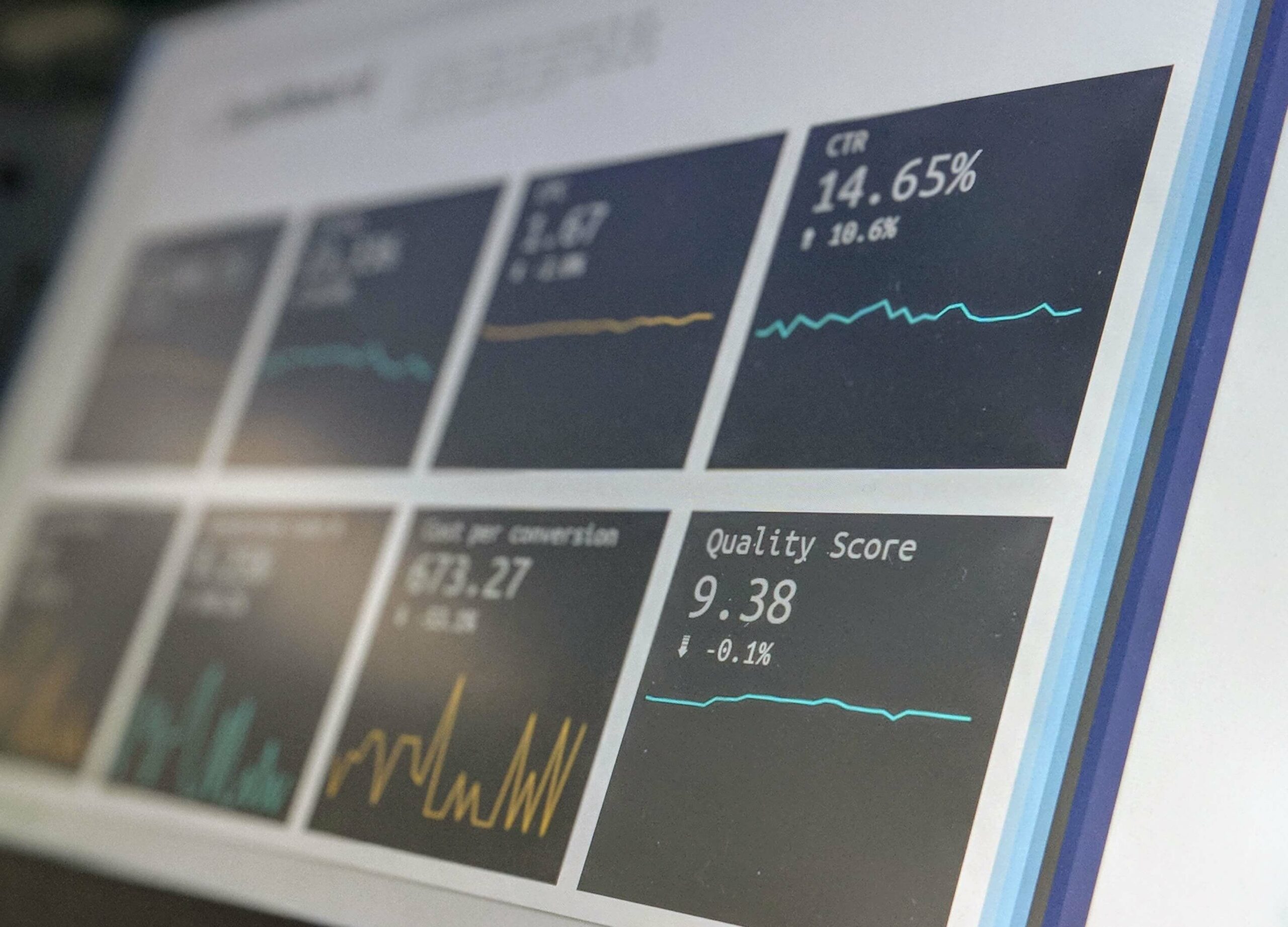
Make your Datastudio dashboards interactive

End goal: a real-time report that is updating itself automatically, that allows interactivity and that can be shared in total transparency with the client. Bonus: you might even be able to use it for more than just one campaign or one client if you make it into a template.
At CLICKTRUST, we’re building all our reports through Google Data Studio. Let me quickly walk you through the main features we’re using.
Data connectors
Google Data Studio offers some direct data connectors.
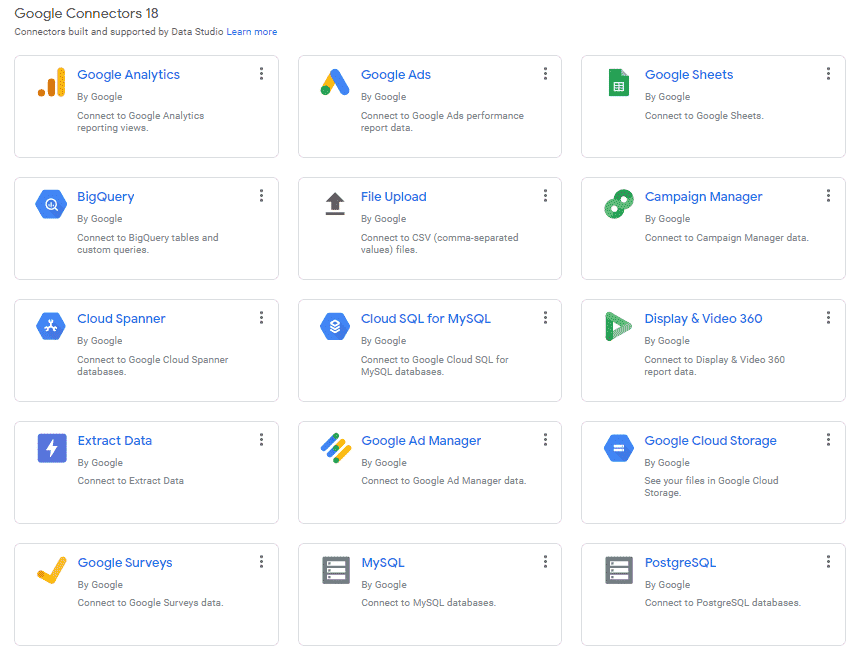
But you can also use third-party connectors, which allow you to directly connect any type of data to your Google Data Studio report. No need for extracts and sheets anymore, everything is waiting for you in one and only place.
Blended data
Getting your information from only one data source is usually not enough.
Easy example: let’s say you have multiple conversions in one search account but only want to provide the cost per one of the conversions. You can’t filter cost per conversion based on conversion action (Google Ads doesn’t allow you to filter cost based on conversion action). To be able to do so, you’ll have to blend your data.
There are 2 different ways to create blended data:
- Select the 2 data you want to blend, click right and select “blend data”. This will open a new window where you can create your blended data.
- Go to Resource > blended data > create new. From there, you’ll be able to choose your data sources and create your blended data.
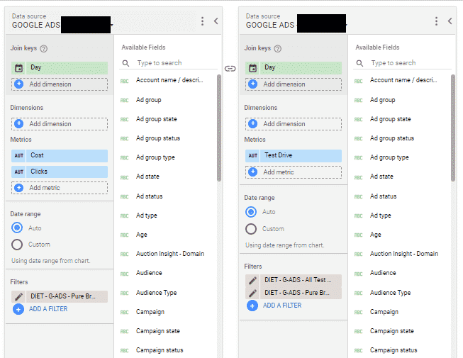
In our example, we’ll have to blend our Google Ads data source selecting cost with the same Google Ads data source selecting all conversions filtered on the conversion action name. Don’t forget to rename your “all conversions” metric with the name of the conversion you’ve filtered.
Custom fields
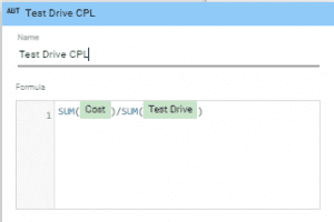
Custom fields let you use your own formula to calculate metrics. You can either use them as metrics or dimensions. In our previous example, we wanted to calculate the cost per test drive. To do so, we’ve created a blended data that has both cost from the Google Ads account and all conversions filtered on Test Drive conversion action. Now that we have both data we need, we have to create a custom field to get the cost per test drive.
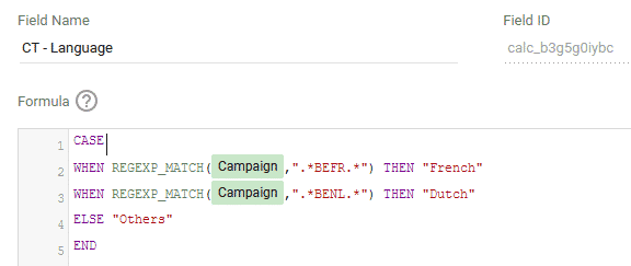
Custom fields can also be used as dimensions. At Clicktrust, we are huge defenders of highly segmented campaigns. This means that we can end up with a lot of campaigns (French only targeting broad keywords, Dutch only targeting mobile devices, etc.) which makes the overview by campaign not really readable in a simplified dashboard. To fix this, we create custom fields using the CASE WHEN formula. That way, we can merge together the data from multiple campaigns under one single name.
Need an example? Let’s say that you’ve split your campaigns targeting different devices, languages, and match types for optimization matters. You then end up with 8 campaigns :
- BEFR_MOBILE_BROAD
- BEFR_MOBILE_EXACT
- BEFR_DESKTOP_BROAD
- BEFR_DESKTOP_EXACT
- BENL_MOBILE_BROAD
- BENL_MOBILE_EXACT
- BENL_DESKTOP_BROAD
- BENL_DESKTOP_EXACT
What if you only want to show how BEFR campaigns are performing compared to BENL ones. You just need to create a custom field inside your data source using the CASE WHEN formula (Resource > Data sources > Edit > Add a field). This will then become an available dimension and you’ll be able to show metrics based on this new dimension.
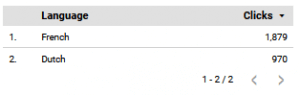
Put in a table, your new dimension will appear that way :
Controls
Controls are filters that let you interact with your data. Would you only want to see the data for the last 30 days or only for mobile devices? Controls will let you filter this out. Time to really make things dynamic.
Now that you know how to create blended data and custom fields, you can create blended data that are using custom fields as their join keys. Depending on what you need to show, your graphs can now be updated based on your custom fields by just adding a control next to it.
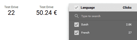
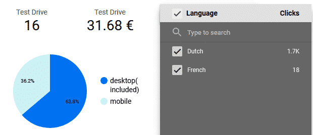
Back to our example. Let’s say you want to show how many test drives you received thanks to your campaign and the cost per test drive. But you also want to be able to show the split between the french and dutch campaigns. You’ll have to follow these steps :
- Create your dimension custom field using the CASE WHEN formula to merge data from your BEFR and BENL sub-campaigns.
- Create your blended data to select cost on one side and all conversions filtered on test drive on the other side. Use your newly created custom field as the join key. This will allow you to use this same custom dimension as the control later on.
- Add your scorecard (or any other graph) showing the test drive and cost per test drive.
- Add a control on the dimension custom field (here language). In view mode, by selecting either french or dutch (or both) the reader will be able to compare the performance of both languages or have a view of everything together.
Graphs interactions
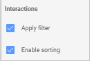
Last but not least, make sure that your graphs will be sorted and can be used as filters themselves. To do so, open the graphs set up window, and check the last box : Interactions. There you can check “apply filter” or “enable sorting”. Any graphs can then become a filter too.
Back to our example, we’re displaying test drive and cost per test drive and we have campaigns targeting mobile and desktop. By adding a small pie chart next to it, showing the number of test drives coming from mobile and desktop campaigns, you can also allow the data to be sorted by clicking one part of the graph. Do you only want to see the cost per test drive for the mobile campaigns? Click the mobile section of the pie chart in view mode and all data will update themselves.
Now I guess you just need to figure out what you’ll do with all this extra time.

Get our ramblings right in your inbox
We deepdive into hot topics across digital marketing and love to share.