Better dashboards simplify your data workflow, making it easier to analyze insights quickly and clearly communicate findings to stakeholders. By making good design choices and utilizing advanced functionalities, you’ll be able to create dashboards that impress clients, managers, and teammates with streamlined, easy-to-understand visuals.
So, let’s dive into our three cool, actionable tricks right away!
Trick #1: Easily Display Both Period-on-Period (PoP) and Year-on-Year (YoY) Comparisons Together
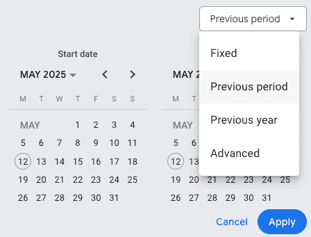
Currently, by default, Google Looker Studio only easily lets you compare one type of period (e.g., either period-on-period or year-on-year) in each widget. But what if you want to analyze both comparisons side-by-side for better context? There’s an easy workaround. Here’s how:
Step-by-step:
1. First, select your metric (such as conversions, revenue, cost, or clicks).
2. Duplicate the current metric
3. Select your newly duplicated widget. Adjust the comparison to be the other type you haven’t used yet. For example, if your first widget is comparing year-on-year, make your second widget compare previous period (period-on-period).
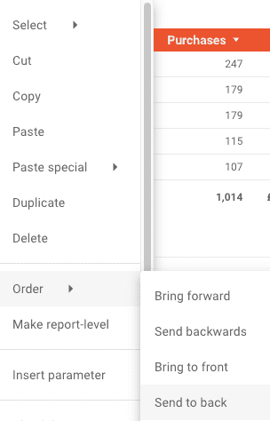
4. Ensure your design is neat by placing the two widgets next to or closely below one another. You will need to click “Send to back” on one to keep your alignment neat.
5. Carefully label your widgets: insert clear text boxes indicating “Year-on-Year” vs “Previous Period”. This helps highlight exactly which comparison is displayed where.
Tip: Make sure you use clean text labels and consistent design, which will greatly improve clarity for anyone viewing your dashboard.
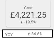
And just like that, you now have a single-page dashboard with metrics easily compared for period-on-period versus year-on-year:
Trick #2: Enable Cross-Filtering Graphs for More Interactivity
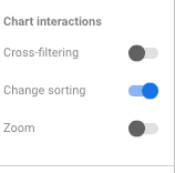
Interactive dashboards are impactful dashboards. Did you know there’s a powerful built-in functionality called cross-filtering in Google Looker Studio? Cross-filtering allows you to filter dashboard-wide data dynamically by clicking directly onto chart elements.
Here’s how to activate cross-filtering on graphs quickly:
1. In edit mode, select your existing chart or graph.
2. Head over to the “Setup” panel (on your right-hand side).
3. Scroll down until you find the “Cross-filtering” toggle and enable it.
4. Switch to “View mode” to see it in action! Clicking on a certain date or data point within your chart will now dynamically filter all associated widgets on your page.
Example of Cross-filtering Use:
Suppose you click and select a range or a certain specific point on your line chart showing your costs or conversions over time. Instantly, tables, scorecards, or other visuals tied to that data will update dynamically to reflect the selected range only.
Trick #3: Make Better Comparisons Using Your Naming Conventions and Custom Dimensions
If you’re running ads, campaigns, or even website content with clear naming conventions (e.g., video ads versus static ads, winter versus summer promotion, brand-related vs non-brand campaigns, and so on), here’s a clever trick to dynamically leverage it inside Looker Studio:
Step-by-step:
1. Always ensure your ad or campaign names clearly reflect categories you can segment by (for example, “Static_AD1”, “Video_AD2,” etc.). Good naming convention is crucial here!
2. Select the widget you want to use to display the comparison (such as a table or pie chart).
3. Create a new calculated dimension with a “CASE WHEN” statement, using REGEX to identify your categories.
Example CASE statement for video/static differentiation might look like this:
CASE
WHEN REGEXP_CONTAINS(Ad Name, “Static”) THEN “Static”
WHEN REGEXP_CONTAINS(Ad Name, “Video”) THEN “Video”
ELSE “Other”
END
4. Use your newly-created dimension as a dimension in your table or graph to immediately compare performance between categories, clearly displayed and easily understood.
Tip: Set clear naming conventions ahead of time and keep them consistent. This method can also help compare campaign promotions, offer types, content themes, and more.
This visibility is powerful, especially for quick insights and easy storytelling.
Great dashboards aren’t just good to look at—they tell impactful data stories that empower smarter business decisions. With these three easy-to-implement yet powerful Google Looker Studio dashboard tips, you’ll craft clearer comparisons, interactive visualizations, and dashboards that anyone can quickly understand and use effectively.
If you need help to build your dashboard do not hesitate to get in contact or check out here our upcoming training on Dashboarding